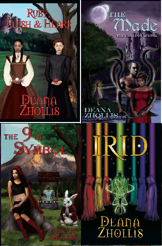
Sigh… I really liked that cover!
So, I went back to my cover designer, who, unfortunately, is no longer working full time for authors, but is still available for long term loyal clients. THANK GOODNESS! Even though it might take her a bit more time to produce, since she now works full-time for a major company, I’ll wait forever for her art!
The first suggestion from my cover designer was that she felt that what was saying “young adult” the strongest was the colors and the fantasy creatures. So, she added a black border around the characters.
 |
 |
But I LOVE my fantasy creatures!! Next, idea was to aged the women. I wanted something to show a bit sex appeal and suggested daisy dukes. I know. I was desperate LOL!! My cover designer basically said, “Oh no!” She never sees grown women wearing daisy dukes! LOL!! Honestly, she suggested, let’s just skip that idea. LOL!!
2nd update — She gave the purple and turquoise shirts, Tank-tops; added a bit of cleavage for the red shirt; a bit of belly-showing on the green shirt; took off the backpacks (though in the novel they did use them, but backpacks make them look younger); and darkened the background.
 |
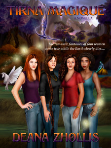 |
Still…it just wasn’t meeting the criteria. My cover designer said again, it was the “visual cues” that was missing the target. She finally came up with the answer.
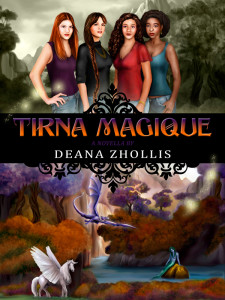
In the Tirna Magique cover, people are taking the visual cues of color, i.e. purple trees, and the fantasy creatures in the background that we psychologically associate with children and stories for a younger audience when they are trying to interpret the intended audience for the book. But since you really don’t want to lose those aspects, my thought is to remove the women from that environment and set them in a more informational neutral background which will help break the association of the characters with the young adult vibe and works with the whole traveling between worlds part of the storyline.
 |
 |
Yes! Yes! and more Yes!
This definitely helped in what was needed!! It’s probably not completely away from the “young adult” feel, but it’s close enough. I get to keep my unicorn and mermaid, and the characters also have a background and image of looking older. It also gives that vibe of going from a bleak environment to a radiant one, which is the theme of all my books. It definitely fits!!
Here again is my wonderful new cover! I’ve already uploaded to Amazon and Zhollis.com
And, you know…? I actually like this one just as much as the other one.
Lesson learned: Changing doesn’t hurt as bad as I thought.
See the previous post for Tirna Magique’s (FIRST) Book Cover design steps.
See the previous post for Creations’s Book Cover design steps.
See the previous post for Jetta’s Book Cover design steps.
See the previous post for Irid’s Book Cover design steps.
See the previous post for Ruby, Flesh and Heart Cover design steps.
See the previous post for The Made Cover design steps.
See the previous post for The 9th Symbol design steps.
