Archive for the ‘WebDesign’ Category

Website Updated!

In my last post, I mention how time flies. Well… time flew by again! LOL!! Here I am, three more years later, and posting on what’s going on in my Self-Publishing life.

My first blog post was 12 years ago!

Over the years, many writers have abandoned blogging and have gone straight to just, well, writing. They’ve placed their concentration on the novel and marketing it. Blogging takes a lot of time, and doesn’t bring a lot of traffic. Thus, here I am, not posting as often as I had done in the past… but I can’t just let it go. I actually love the content of my blogs and I still want to visit, like an old friend, from time-to-time.

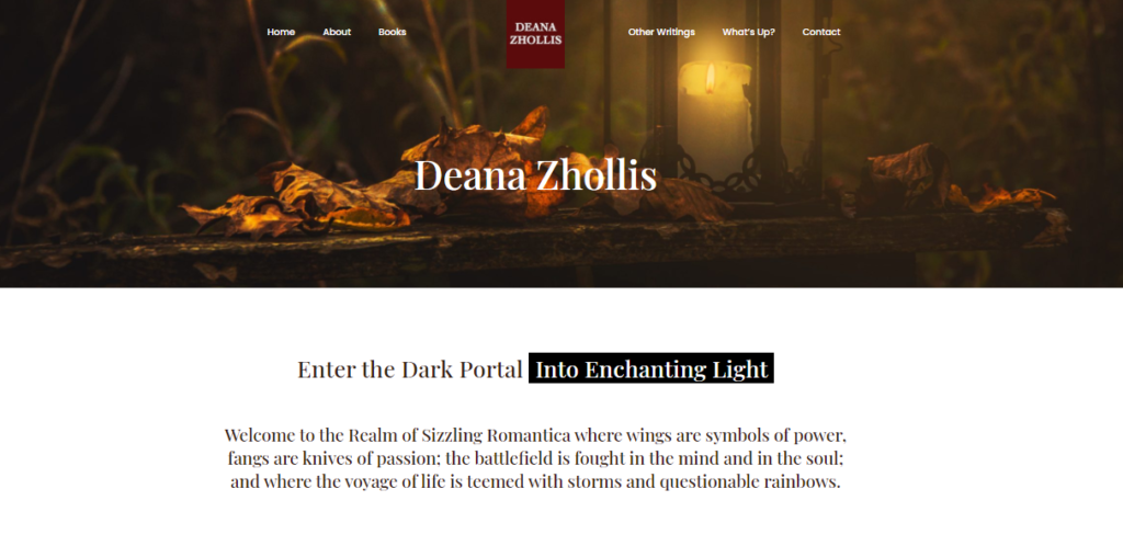
So here I am again, now having to have something to say to “my old friend”. I have finally upgraded my main website! It’s been a long time coming. It wasn’t mobile, tablet friendly, and it just looked very dated. Like 2008 dated old! I got the template from TheTemplateStore.com back in that day that came with a txt license from Sandy Bowen to place with the site. I loved this site! But change is a must. Sigh. So I had a good cry, and I let go.

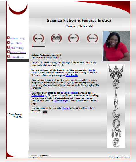
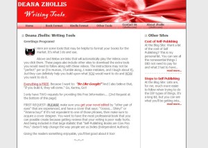
I mean, I learned HTML and had to change from my very first website:

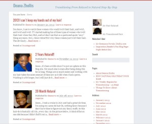
Then, I went on to this website:

And now for 2020, to go back to Guru, to find a web designer to help me with the newest website project. I was fortunate enough to find that the designer, who moved my website from ICDSoft to HostGater, was still on the site. She took down my ideas and went to work.

Little did I know that so much has changed on WordPress since the last time I logged on. I am currently type in, Block format? And there’s the BeTheme that was out of this world!

Well, back to the classroom I go.

I found a YouTube video on how to work around in BeTheme, and WordPress directed me to their site on how to use this new Block format.

Self-Publishing learning NEVER stops!

Now, I have a WONDERFUL looking website (If I do say so myself!) and I simply enjoy how everything flowed together from my old to my new site.

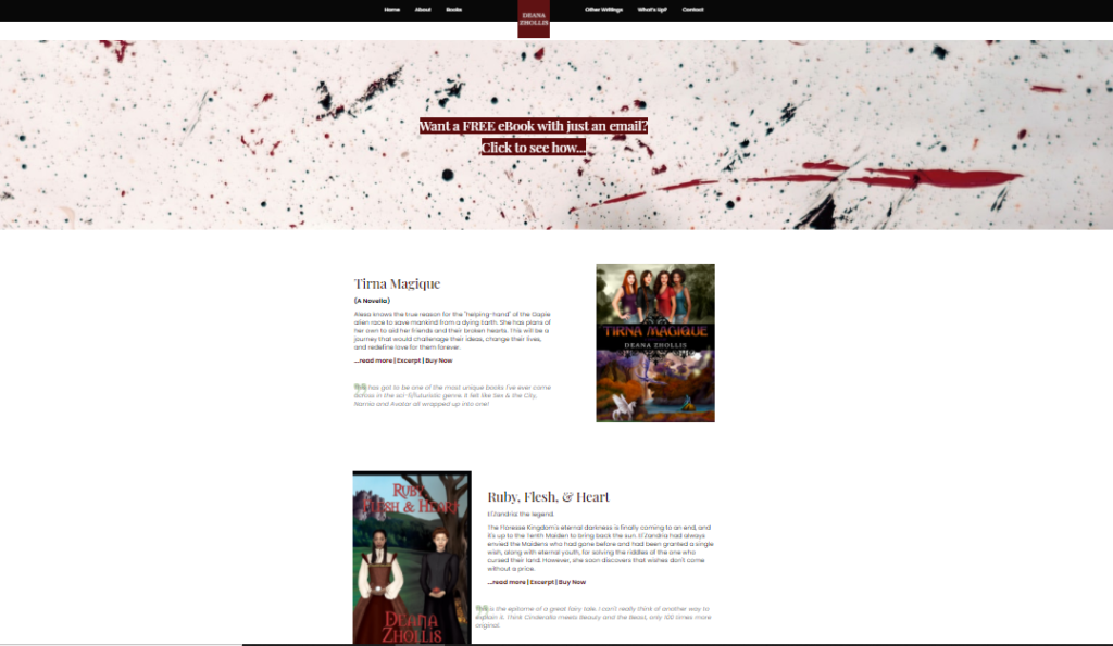
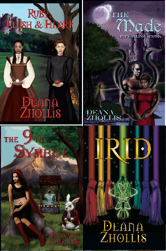
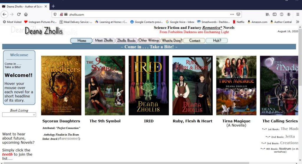
My web designer introduced me to UnSplash where I can get my visual candy for my site, and chose some awesome pictures. We also just added a few books to the main page, and viewers can scroll down the page, click to email me, and use the Menu to go everywhere else.

It’s sleek. Its precise. It’s easy to navigate. It’s…modern! I so just love the new look. It’s me….

Well, that’s all I had to say this time. I wonder when I’ll post again…. Hmmmm.

Until next time!

Whatcha Doing?

ProjectsSept2015I haven’t posted for awhile, and I decided to add something to this blog site after an email accidentally went out displaying my old content. And why did that happen, you might ask for those still subscribing to this site? Well…. What happened was….uh…. LOL!!

Changing Hosts!
Just kidding. What happened was that I was changing host sites. I’ve been with ICDSoft for hosting my website for years, and finally changed to Hostgator. Why did I change, you might ask? Well, I wanted another .com (domain) website, but I didn’t want to manage it with a completely different control panel (cpanel) and login and password. Hostgator has the “addon” feature, where I can create, thus add, another .com (domain) website and manage it within the same control panel (cpanel) as my other .com (domain) website. Get it? So, basically I want to manage two different websites under one management tool. ICDSoft didn’t offer that option, so I decided to change because…

…I kinda likes that feature!

So what’s the other .com website? Well, it’s just some of my (what some people would call) strange beliefs, which I had posted on this blog site. But it really shouldn’t be on here. Two different subjects should be placed separately. I’m a snail, you know, so I do make changes slowly.

I ran into some problems, as usual, with making such a huge change. Even though I went back to Guru.com to find someone to move everything for me, problems arose. I got a 500 Hostgator error on all my .php pages. I found out I had to change the permission on the files. Previously, they were 0644 on ICDSoft. On Hostgator, I had to change them to 0755. Then, some of my images, just didn’t show. But when you click them, I could see the image. I just replaced each and every picture link that had the problem. That required going through the entire blog and finding them. It wasn’t all the images, so that was good. Why that happened, I just couldn’t find an easy answer.

And why am I updating and fixing errors when I paid someone on guru.com to do the move? Well, I wasn’t quite precise on what I wanted and the job required a lot more time and effort than the description I gave. So, to make up for that, I just went ahead and fixed the little problems that did arise, though it took my hours to figure it out through searching in Google. Nonetheless, it got done.

Another Anthology Project
I’ve been asked to be part of another anthology. I’ve got my 2nd draft done, and I’ll get it edited soon after one more look over. The deadline for the completed work is January 2016, so I have time to get everything done…with my slow self. I have been asked to do an anthology before, but it unfortunately got canceled. That’s how I ended up with Tirna Magique. With this new project, and new short story, I figured if things don’t go as planned, I’ll just make a book of short stories. I have plenty of them just sitting around for years and years and years, so why not put them all together and share them with the world! Even if this anthology project doesn’t get tanked, I figured I should put together those short stories anyway. That will be my next, easy, project to complete, since novels take much more time these days.

Another Irid book
I’m currently working on another book within the Irid world. Have I mentioned this before? I don’t remember… Anyway, this one is placed a few hundred years after the first novel. It’s coming along…uh… I’m half way through it…being that I started it around November 2013. Yeah…I’m slow.

I’ve got one more thing I’ve finished working on, and its been a long time coming. But, I’ll post that update later.

Until Next Time!bite


Why I LOVE the GURU Website!!

timeworrylateNo knowledge? No Skill? No Time?

a) One of the above?
b) A couple of the above?
c) All of the above?

That’s exactly where I was with two (2) of my websites.

One of the websites has been sitting on my mind for YEARS, and the other website, yeah, a few years too.

They needed to CHANGE!!

Website #1

I had typed up these really specific details for Website #1 which was on the Movable Type platform. When I first started looking for places to put blogs, I thought Movable Type was the best option…until I started working with it. Then I wanted to discard it, but then used it anyway. I kept HURTING myself for no reason! I even mentioned in this blog: WHY did I do this Movable Type AGAIN?!! And I had NO IDEA. Besides, just trying to get something to work that was already created and activated, there was no sense on continuing with it. It was a HEADACHE! So much so that I LOST all my comments on it by accidently deleting the WRONG THING!!! UGGGGGGGGgGggggggghhhhhh!!!!!

I needed Website #1 to be moved from Movable to WordPress, and the information on the internet looked too hard and too time consuming for me to do it myself.


Website #2

I tried to quickly put together a website that was REALLY informative, but use a FREE template website design to create it. All those hours of making How-To videos for Website #2 was just wasted on a very, very, ugly, unsightly, silly looking site.

But I just didn’t have the time to convert Website #2 to a better look and feel.

Da-dada-Daaahhhhhh!!!! GURU to the RESCUE!!!


I don’t know WHY I didn’t do this before! But I was talking to a friend of mine on how he could update a business website, and make it look really professional looking. I gave him the advice to use GURU and FIND someone to do it for him. Well, he decided to use templates and a lot of time to try to fix it himself. I kept telling him to use GURU, and he simply refused–still peddling along trying to do it all himself.

Then it clicked! I’ll SHOW him how EASY it is to just get someone else to do it for him.

WHY DIDN’T I THINK OF THIS BEFORE???!!!!


So, I started off posting a project for Website #2 on Guru with a title: WEBSITE UPDATE. I explained what I needed, and how HORRIBLE my existing website was, and I got over 40 requests with ranges of costs from $100.00 to $2,000.00. The time I would have taken to try to redesign the website myself was placed into the time to go through the suggested cost quotes and resumes of the skilled WebDesign companies and individuals. Actually, it was a lot less time. I simply took my time to go through them.

Guru has change A LOT since I had been on the site and found my Cover Designer and Editor. Using the Web Design category this time, I got quite a slew of requests–mostly from India. Not only did I get so many responses, I also got the same requests sent to my Facebook Page, my LinkedIN, my Twitter, and my personal email!!

MAN! I understand persistance, and trying to stick out from the competitions, but that took the CAKE! They had looked at my website I wanted to redesign, got my contact information from i,t and found me on every platform they could find to send additional contact information on their interest on re-designing my website.

Needless to say, I developed an elimination strategy. Grrrrr!!!

  • Those who called me: Dear Sir (eliminated!..If they would have included “Madam” in the title, I would have left them on the list, but NONE of them did)
  • Those who just sent general “canned” information about their company and nothing specific containing information about my website (eliminated!)
  • Those who just sent two-line sentences that basically said: We can do that project (eliminated!)
  • Those who quoted above the $0-$250 range that I submitted (eliminated!)
  • Those who did not have samples of previously designed websites or references (eliminated!)
  • Those who sent me a list of websites and I couldn’t connect to them (eliminated!)
  • Those whose profiles stated they were based in the United States, but when I went to their websites, they had signs that they were NOT in the U.S. (ELIMINATED! — I don’t like misrepresentation!!)
  • Those who couldn’t reply to my questions in a way I could understand them or replied without answering all of my questions (ELIMINATED!!)

Next, was to rate the quotes of the ones I wanted to take a 2nd or 3rd look over their designs. Then, I took into consideration their price quote. Finally I settled on a designer.

I was so excited about getting my Website #2 redesigned that I remembered Website #1, and how I wanted to changed it to the WordPress platform.

I started another project with the title: Movable Type to WordPress–Blog Website

All-in-all, I paid $250.00 for Website #2 (which I could have gotten done at a lot lower price, but I decided I wanted to work with this particular designer because I liked his designs, and he was going to give me the files, like I wanted, for me to continue updates on my own via Dreamweaver)

I paid $160.00 for Website #1 (which, again, I could have gotten lower, but this designer answered all my questions, wanted to do EXACTLY what I wanted, and got it all done within a DAY!!).


Here is Website #1. Before and After. It doesn’t look like much now because I need to go find a cool skin that I want to put with it, just like the skin on this current blog that you’re reading now.

Before After
oldBlogWebsite NewBlogWebsite
Take a look at the actual Website #1


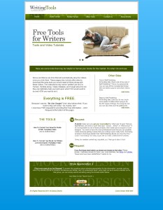
Here is Website #2. And it looks AWESOME compared to what it looked like before. I’m just SO VERY happy for this update. Also, now, I don’t feel so sheepish when directing people who saw my YouTube video and then went to my website, only to see some silly-looking, amateurish website that wasn’t very easy to navigate. It looks SO VERY PROFESSIONAL… NOW!!

Before After
OldToolsWebsite Mock2
Take a look at the actual Website #2


So, the moral of the story??? Get the extra help when you:
Don’t have the Time.
Don’t have the Skill.
Don’t have the knowledge.

The relief to get something COMPLETED… FINALLY! was one big Awesome SIGH for me!!

…and my friend? Well, I told him my story and showed him the results.

He’s still twiddling with his business website.


Until Next Time!


Oh Well…Just Not Gonna Do Another Techie Thing

Soooo, I found out that google no longer uses the “Note In Reader” tool, which means I can no longer do this nifty trick: Tutorial: Create RSS Feeds for your Website. And that’s really upsetting, because I just can’t figure out all that HTML coding and such for my static (or don’t-change-so much) website www.Zhollis.com to have RSS on it’s page.

Darn it! Darn it!

Oh well. I guess I ain’t gonna do it…period.

Sometimes with all this techie stuff, you just have to throw in the towel and submit and give up.

I don’t have time do figure out and research all the RSS stuff. But then again, I’m wondering if anybody uses it anyway….

Then there’s the “Subscribe” field I could add to my site, but I can’t figure out a way to do that either. I mean, I could use MailChimp which is FREE and what some people have done, but I figure it would be a learning curve just like when I had to learn how to build my own Contact Me Form. I mean, I did A LOT for my webpage and even put a blog out when I finished building everything that listed on all the websites I used to help me. But then I took a look at MailChimp and found out it isn’t that much to do, it’s just that their Form is pretty basic and you need an actual picture banner to make it a bit more of your own. So, the form isn’t quite “your” website per se. It isn’t a part of it like my Contact Me form is exactly on My website, but it’s on MailChimp’s site (well, that’s how it looked like it functioned).

Thank goodness the blog sites (My Word Press and Blogger) don’t have that problem and adding Apps and neat little features to them are a cinch. But having your OWN website without all the nifty tools to help you build it…well…it can be a pain in the, uh, bottom.

Sigh. Oh well. I just removed the darn RSS that was on my website, which wasn’t working very well anyway, and called it a day. I’d look into more on MailChimp later. It seemed to be my easiest choice.

If ya’ll have any other ideas out there, give a girl some help, will ya! 🙂

Until Next Time.


I just want to write, Darn IT!

I’m so constantly trying to keep up with my weekly blogs (though I now have plenty of time to finish up some novels too while out on medical leave), that I figured I’d take a peek into Wattpad and Scribd. These are also places to promote your free writing. And it’s actually a fun place to be if you’re that type of author who just want to … WRITE STORIES!

Yeah.

How many times do you want to do just that–just write. Authors don’t want to market. Authors don’t want to sell. Authors don’t want to do the network socializing thing. Authors don’t want to market. Did I say that already? Yeah. Authors want to write, darn it! That’s what authors do. And if you’re determined to do just that after getting your book uploaded and your wonderful cover drawn, then you might want to look into marketing in a way that still have your creative juices flowing, and increase your fan base.

Wattpad and Scribd

These two places are THE perfect places to do just what an author want to do. Just write your dreams, your muse’s inspirations, you heart desires, your funny witticisms. Write it all out there. It’s a GREAT alternative to those who just don’t want to blog or Twitter or LinkedIn or Google+ or do the Facebook Page thingy. The reminded me of, Waaaayyyy back in the day (around 2000/2001) when there was a site called Themestream.com. It was a place where authors got paid by how many readers read their material. It was little pennies, but if you got a lot of views, you were able to make some decent money. Unfortunately, it went under, and a lot of writers were really upset about it, not because of the loss of money, but because it had a community that was unique and wonderful for writers to engage in. I think Wattpad and Scribd is creating that environment once again.

Wattpad is a place where a writer can share stories on the web and across mobile devices. You upload your stories in sections. Even short stories are uploaded in sections because the audience is mainly reading these stories from their cellular phones, and reading in parts is much more easier on a little screen.

Scribd is like a huge book club, somewhat like Goodreads, LibraryThing and Shelfari, accept what you read is actually on the site. It’s received a lot of bad publicity on the internet by authors who said this sight had their works, and was sharing them, without permission, but I believe the site has focused on that area and corrected it for the most part. It’s still a place where millions go to read. If you’ve already logged in with your Facebook account, please note that Scribd will automatically set you up an account based on your Facebook account.

So, those are two places an author could look into and keep writing and gain fans. I think they’re great possibility areas where authors can share their craft. As for me, I know I said I will be looking into these two things, but I just took a quick glance, and I’m currently really need to focus on getting more novels on my virtual book shelf. If I didn’t have my job and had more time to write, these are places I would seek out.

What do you all think? Are there any other areas where writers could just write to gain a fanbase? What have your experiences been on Wattpad and/or Scribd? Does anybody out there still even remember Themestream? LOL!


Pictures and Blogs

picspeakIf you started reading this blog site from the beginning, you’ll notice there weren’t any pictures for each subject I spoke about. Being that sometimes I’m late to the game, I didn’t realize, on the internet, how just “words” could be so boring. What made it dawn on me to starting posting up pictures? I looked at other author blogs and realized, as a reader, what I found appealing.

PICTURES!!

I mostly use the ClipArt in MicrosoftWord and modify them with Gimp or Paint. Then, when I did a little research and learned on some forums where I could get some pictures from, I included that as well. I mainly search on Flikr for “Creative Commons” images that have rights to modify and create derivative works. There’s also Stock.XCHNG that has photos. It was mentioned that you can find some fonts too, free fonts at FontMaster.com and 1001 Free Fonts. If you make your Book Covers yourself, these are good places to find stuff.

I wrote a blog on how to size your pictures for websites. That’s important to have the right size picture and wrap words around it.

The other thing I’m still debating on is how often to post on my blog. I really, really, really, don’t have much to say on self-publishing unless I run into something that triggers a topic. Posting three (3) times a week, the internet world states, is the key to getting an audience. Once a week, keeping a schedule on a specific day of the week, works too. I like the once a week thing, but that takes material, and, again, I don’t know what to provide that’s not already in one of the lists above already.

I really would have to dig around for some content…or get guest blogs; but I’m picky about novels because I don’t want to have an author on my pages who I’m not interested in their writing, or doesn’t have much of a fan base–such as myself.

So…. I’ll think about it….the once a week thing. We’ll see.

What size should pictures be on my webpage?

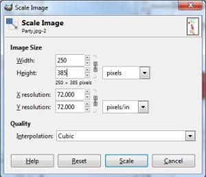
I put my pictures around 200-250 x (???) whatever makes it still look normal and not stretched out.

GIMP (which is Free, you know) helps to automatically size my pictures when I type 250 for the width and the height it takes care of.
You just go to IMAGE > SCALE IMAGE

ScaleImage

The image above is 398 X 342 pixel. The resolution is 72 pixels.

Fortunately, in WordPress, it gives you a suggested size for images before inserting them, so you can choose small, medium or large no matter what size you make the image. However, in Movable Type, there’s no help in sizing. You have to size the images BEFORE you upload them. What I do like in Movable Type, though, that in the DRAFT view while you’re typing up the text for your page, when you insert an image, it actually displays the image. In Word Press you have a very, very long HTML code and have to use the Preview to view how it looks.

Need to cut your pictures to 800×600? Use FrameSize. You can NOT keep the entire image when you turn it into this size without skewing, but you can view what will be cut out first before sizing it with this frame tool. This helped me with my Book Trailers.

I just wanted to write something up about that, because it was a question of mine when I first started posting and then decided to add more pictures to my blog so it doesn’t look so… blah. With my website, I don’t worry too much about the picture sizes because I can immediately view it in Dreamweaver just like Movable Type, and drag corners to resize the images…so it wasn’t a concern.

Hope this helps. Until next time.

What is my website’s popularity?

Want to find out how many people are viewing your website? Or even who put links back to your website from their personal sites? I got a few little places and tips you can use.

Google Analytics
This is the best one yet to view how your website is doing with popularity (do you like me?). You have to copy/paste some code to your website, but it’s worth the bit of effort.

WebStatChecker
WebStatChecker is pretty cool as well. Just type your domain in, and click on the underlined hyperlink number for the Yahoo Backlinks. But for Yahoo Backlinks, the below method will pull the same results.

Advanced Search Operators
You can use this method that’s in all of the major search engines. For example, in Google search box, I would just type: linkdomain:zhollis.com, and it will give me a list of sites who have my site linked on them. I can type it in Yahoo, Ask.com and search.aol.com. But for Bing (this is also MSN search engine), I had to actually enter and search for my site name FIRST, then press the “Advanced” option menu. It used site:zhollis.com, which I didn’t want; so I did -site:zhollis.com (see the negative sign says “exclude”, meaning “Don’t look for this”) and also retyped zhollis.com to see if it will displays sites containing zhollis.com without finding my actual site. It looked like this [-site:zhollis zhollis.com]. It didn’t bring up much 🙂 .

HeadKeys
Headkeys gives you an idea of the popular Key Words your website is using that people will search for and possible click to come to your site. Not sure how this will help, but it might tell you how strong your site is with the key words people normally search for.

Reverse Internet
Reverse Internet can give you some ideas of who is linking back to you as well.
It didn’t show much for my websites though. But I tried a different website and it displayed a lot of information. So that’s why I’m listing it on my blog.

That’s about it. Go ahead and try some stuff out and see which ones work for you.

Happy Narcissism!

Movable Type…Again…And Going to Natural Hair

So, I’m continually figuring out little ways that I can do to market online, without having to spend too much time, since currently I just don’t have the time. As I do my baby steps towards marketing, that will be one last thing I need to do when I do have the time.

One thing I learned on my internet research is to put your Second Skill to work. If you put your Second Skill out there, you can drive more traffic to your First Skill. For example, my First Skill is writing and I do have a Second Skill, which is my job, of programming telephone systems and call centers. If I created another blog and/or website about my knowledge of my Second Skill, then on those web pages I can direct traffic to my First Skill with just a link/click away.

But, I’m not going to use my Second Skill, since I consider that “work”. I decided to open up another blog page about my new project: Transitioning from Relaxed to Natural Hair. Remember back when in 2008 I was looking for a Blog site? Well, I put my adventures on this page: Finding a Blog…. And I noted how much of a difficult time I had with installing Movable Type that I placed my own instruction on the internet on how to install Movable type to maybe help someone else.

So, why am I talking about Movable Type since I had such a hard time with it two years ago? Well, since I already had that blog uploaded on the net, I decided to use that for my blogging for my steps from transitioning from relaxed to natural hair. I mean, it was there and not being used, right? I had forgotten how difficult it was to even manipulate the thing. That blog was pretty plain, and so I had to figure out, ALL OVER AGAIN, steps on how to make it more personable. It took HOURS! And when I finally figured SOMETHING out (after resizing a picture file using Gimp, figuring out html tables and widths, learning where the header and banner and styles and widgets for columns were and what they did), I was only able to add a little picture and a short list links.

Then, MORE HOURS went in to figure out the RSS Feed for Movable Type (remember my I thought I knew blog). Well, I didn’t quite understand Movable Type atom thing (which is basically like rss), thinking some mysterious icon will magically appear on my header for people to click — something that indicated “Hey! This Page has RSS” button. No magically RSS button appeared, and I finally figure out that it was just “formatting” for people who use an actual software, or their webpage, to pull in the RSS on their browser. So I went to my Google Feedburner, made a thingy there. And copied a nice little path to make me a RSS button and link back to Google Feedburner, adding it to my Movable Type Banner Header. Side Note: I still have no idea how the atom thingy works since that is somehow directed back to my own webpage. Sigh.

Then I found out I had to UPGRADE the Movable Type thingy!! YIKES! That took me TWO WHOLE DAYS to figure out and complete. Duh! Naturally, I typed up instructions on how to Upgrade Movable Type as well. And along with that, I updated my instruction on how to install Movable type, because, 1) you basically have to reinstall the entire thing in order to upgrade it and 2) my first instructions were back in 2008 and outdated. Man! Uploading and Downloading files took 20-30 minutes. And I did it THREE TIMES because I didn’t see the BIG RED WARNING sign to NOT COPY MOVABLE TYPE FILES WHEN UPGRADING.

I’m SO GLAD that Word Press upgrades are now just a Click of a Button.

Don’t ask me why I’m making myself suffer through learning all this stuff. I don’t know. I get into something, thinking it won’t be a big deal, and get stuck. Then, since I can’t let it go, I have to figure it out until it gets solved. But hopefully, in the long run, what I learn will benefit someone else. That’s what I love about the internet, because that’s what I did to learn about how to transition from relaxed to natural hair. I gathered all the information together, and put it in a structure that suited me. And now I’m sharing that information on my other blog site. And as for “Marketing” I put a Big Sign up top:

Websites! I Like!

So there you have it. More steps in my Self Publishing Process.

Until next time… and oh yeah! Happy New Year!