In my last post, I mention how time flies. Well… time flew by again! LOL!! Here I am, three more years later, and posting on what’s going on in my Self-Publishing life.
My first blog post was 12 years ago!
Over the years, many writers have abandoned blogging and have gone straight to just, well, writing. They’ve placed their concentration on the novel and marketing it. Blogging takes a lot of time, and doesn’t bring a lot of traffic. Thus, here I am, not posting as often as I had done in the past… but I can’t just let it go. I actually love the content of my blogs and I still want to visit, like an old friend, from time-to-time.
So here I am again, now having to have something to say to “my old friend”. I have finally upgraded my main website! It’s been a long time coming. It wasn’t mobile, tablet friendly, and it just looked very dated. Like 2008 dated old! I got the template from TheTemplateStore.com back in that day that came with a txt license from Sandy Bowen to place with the site. I loved this site! But change is a must. Sigh. So I had a good cry, and I let go.
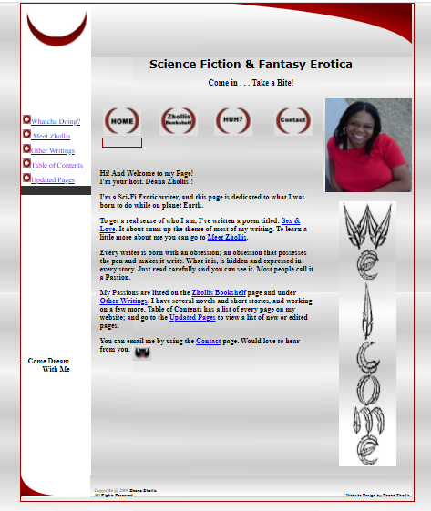
I mean, I learned HTML and had to change from my very first website:
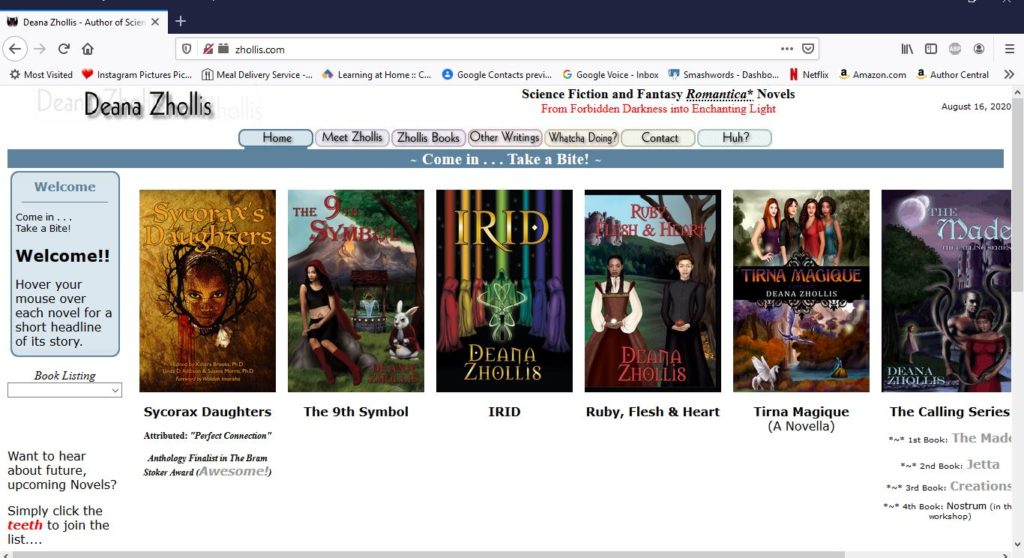
Then, I went on to this website:
And now for 2020, to go back to Guru, to find a web designer to help me with the newest website project. I was fortunate enough to find that the designer, who moved my website from ICDSoft to HostGater, was still on the site. She took down my ideas and went to work.
Little did I know that so much has changed on WordPress since the last time I logged on. I am currently type in, Block format? And there’s the BeTheme that was out of this world!
Well, back to the classroom I go.
I found a YouTube video on how to work around in BeTheme, and WordPress directed me to their site on how to use this new Block format.
Self-Publishing learning NEVER stops!
Now, I have a WONDERFUL looking website (If I do say so myself!) and I simply enjoy how everything flowed together from my old to my new site.
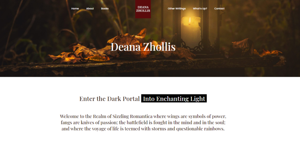
My web designer introduced me to UnSplash where I can get my visual candy for my site, and chose some awesome pictures. We also just added a few books to the main page, and viewers can scroll down the page, click to email me, and use the Menu to go everywhere else.
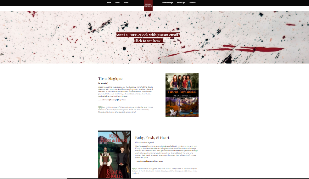
It’s sleek. Its precise. It’s easy to navigate. It’s…modern! I so just love the new look. It’s me….
Well, that’s all I had to say this time. I wonder when I’ll post again…. Hmmmm.
Until next time! ![]()
