Archive for the ‘WordPress’ Category

Website Updated!

In my last post, I mention how time flies. Well… time flew by again! LOL!! Here I am, three more years later, and posting on what’s going on in my Self-Publishing life.

My first blog post was 12 years ago!

Over the years, many writers have abandoned blogging and have gone straight to just, well, writing. They’ve placed their concentration on the novel and marketing it. Blogging takes a lot of time, and doesn’t bring a lot of traffic. Thus, here I am, not posting as often as I had done in the past… but I can’t just let it go. I actually love the content of my blogs and I still want to visit, like an old friend, from time-to-time.

So here I am again, now having to have something to say to “my old friend”. I have finally upgraded my main website! It’s been a long time coming. It wasn’t mobile, tablet friendly, and it just looked very dated. Like 2008 dated old! I got the template from TheTemplateStore.com back in that day that came with a txt license from Sandy Bowen to place with the site. I loved this site! But change is a must. Sigh. So I had a good cry, and I let go.

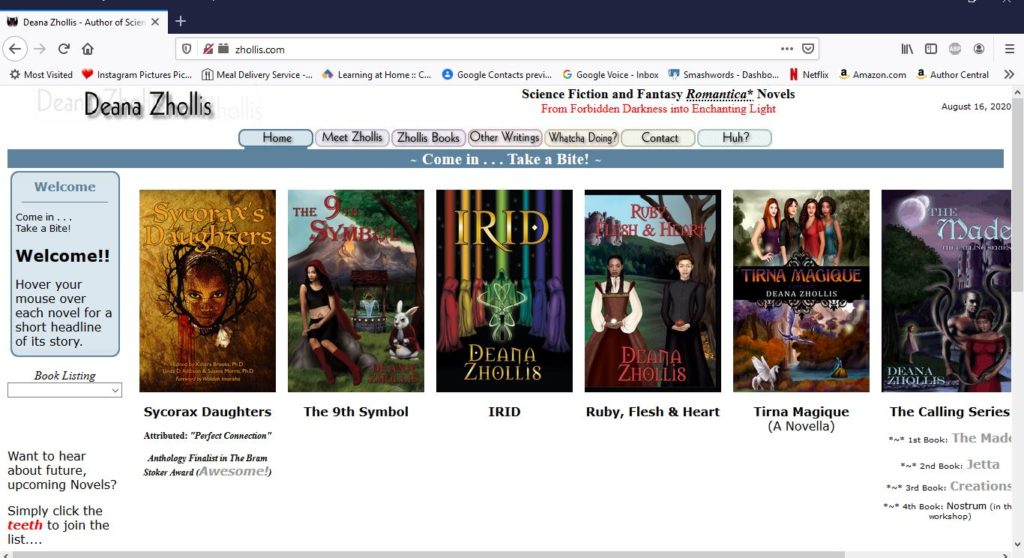
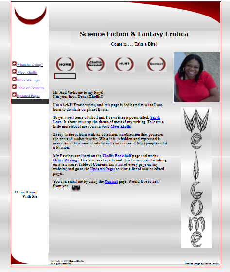
I mean, I learned HTML and had to change from my very first website:

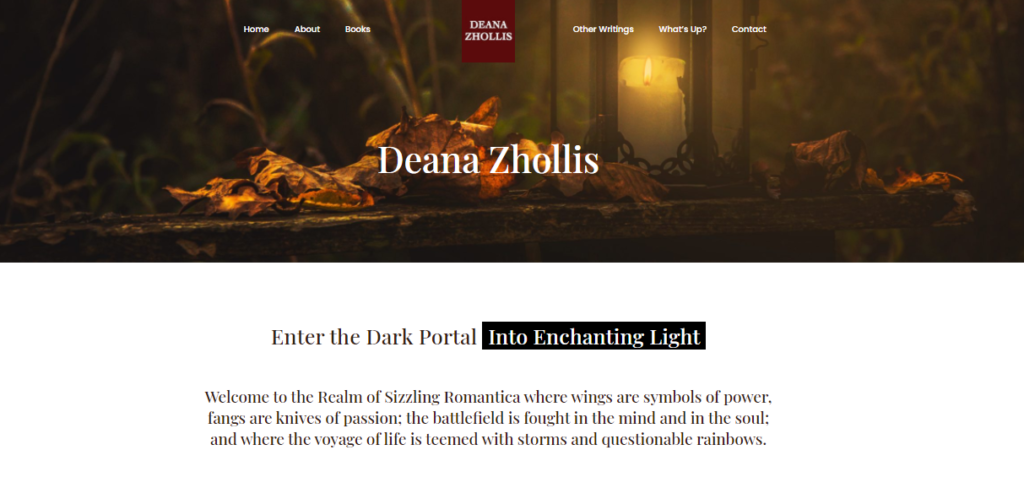
Then, I went on to this website:

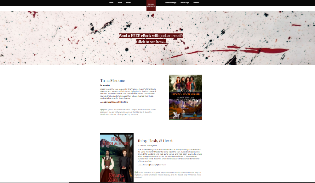
And now for 2020, to go back to Guru, to find a web designer to help me with the newest website project. I was fortunate enough to find that the designer, who moved my website from ICDSoft to HostGater, was still on the site. She took down my ideas and went to work.

Little did I know that so much has changed on WordPress since the last time I logged on. I am currently type in, Block format? And there’s the BeTheme that was out of this world!

Well, back to the classroom I go.

I found a YouTube video on how to work around in BeTheme, and WordPress directed me to their site on how to use this new Block format.

Self-Publishing learning NEVER stops!

Now, I have a WONDERFUL looking website (If I do say so myself!) and I simply enjoy how everything flowed together from my old to my new site.

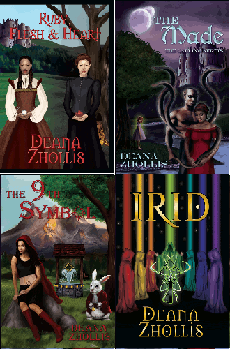
My web designer introduced me to UnSplash where I can get my visual candy for my site, and chose some awesome pictures. We also just added a few books to the main page, and viewers can scroll down the page, click to email me, and use the Menu to go everywhere else.

It’s sleek. Its precise. It’s easy to navigate. It’s…modern! I so just love the new look. It’s me….

Well, that’s all I had to say this time. I wonder when I’ll post again…. Hmmmm.

Until next time!

What size should pictures be on my webpage?

I put my pictures around 200-250 x (???) whatever makes it still look normal and not stretched out.

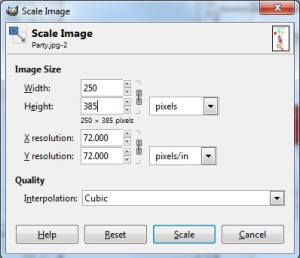
GIMP (which is Free, you know) helps to automatically size my pictures when I type 250 for the width and the height it takes care of.
You just go to IMAGE > SCALE IMAGE

ScaleImage

The image above is 398 X 342 pixel. The resolution is 72 pixels.

Fortunately, in WordPress, it gives you a suggested size for images before inserting them, so you can choose small, medium or large no matter what size you make the image. However, in Movable Type, there’s no help in sizing. You have to size the images BEFORE you upload them. What I do like in Movable Type, though, that in the DRAFT view while you’re typing up the text for your page, when you insert an image, it actually displays the image. In Word Press you have a very, very long HTML code and have to use the Preview to view how it looks.

Need to cut your pictures to 800×600? Use FrameSize. You can NOT keep the entire image when you turn it into this size without skewing, but you can view what will be cut out first before sizing it with this frame tool. This helped me with my Book Trailers.

I just wanted to write something up about that, because it was a question of mine when I first started posting and then decided to add more pictures to my blog so it doesn’t look so… blah. With my website, I don’t worry too much about the picture sizes because I can immediately view it in Dreamweaver just like Movable Type, and drag corners to resize the images…so it wasn’t a concern.

Hope this helps. Until next time.

I THOUGHT I knew….

Yep. More learning lessons. So I thought I understood RSS, but found out tonight that I didn’t. I just put my regular URL in the buttons, and of course, they didn’t work.

So I went to my favorite friend, Google, and found Tutorial: Create RSS Feeds for your Website. It took me a bit to figure out what the site was saying, but it was fairly easy. Much easier than other sites where I had to do more html programming, which I really don’t want to do. This easy way, I created RSS using Google Feedburner, and it’s much easier.

Finally, I made a RSS feed for my Website (Zhollis) and one for my Blog. Now my blog RSS feed button works. For WordPress and MovableType blogs, RSS is already in the programming. I used the “Auto-Detect RSS” button I learned how to add from Tutorial: Create RSS Feeds for your Website, then clicked the “View original RSS Feed” hyperlink that came up on the new page and copied that URL Address to the field in “Original Feed” for Feedburner.Google.com. I’m glad that the Blog sites automatically has RSS built in, but my own original website that I built with Dreamweaver doesn’t have it. The instructions tell you how to add it to Feedburner, but for each and every change to the website, you have to read the instructions to update the Google Reader for the new content. Since I can’t do the hard stuff for RSS, for my static website that doesn’t change much, this works for me. For those who need to automatically have your website update RSS all the time for you, there’s Feedity.

Whew!

I also made a favicon, thanks to fellow writer’s blog All Fired Up (who also suggest making a email subscription so that people will be notified by email that your blog or website has been updated if they don’t want to, or don’t know how to, use your RSS). Thanks to her site, I’m now in the know that such things are possible. Back to the favicon… It now displays my fangs on the tabs up top by the address. When future people bookmark me, they’ll see my fangs! 🙂

*~* I uploaded my fangs to change to my favicon here: http://www.html-kit.com/favicon/
*~* Downloaded the favicon.ico file to the root of my websites
*~* And type the html path right below the <head> in header.php for Word Press
and right above </head> on my novel website.

What I used in Word Press
<link rel=”shortcut icon” href=”<?php bloginfo(‘template_directory’); ?>/favicon.ico” />

What I used for my regular website
<link rel=”shortcut icon” href=”/favicon.ico”>
<link rel=”icon” href=”/favicon.ico”>

I kinda like it!

Where are my buttons?

So here I am, trying to show my site to someone at work and BEHOLD, I couldn’t find my Plugin Social Buttons! You know, the stuff where you can know there’s updates on the page and link to Tweeter, Facebook, or news-feed. And that song Buttons from Pussycat Dolls popped in my head. Someone loosened up my buttons!

At first, I just thought it was my company blocking stuff, but then when I checked at home. NO BUTTONS. Back to research. I went to my WordPress plugin’s website, and found out that since Word Press version 2.4.5.0, I now have to add a html line to my footer.php page. And I did that. Buttons Returned!!

I’ve been doing my updates for WordPress, and I don’t even remember when I had 2.4.5.0 or how long ago that was. So I went to find the WordPress versions timeline and the date that they came out, and it looked like that was some time ago. I just added my buttons in April 2010. So I don’t know what I did to loosen up my buttons…uh…loose my buttons. But they’re back now!!

More on Amazon DTP
So yesterday, on my day off, I did some more research on Amazon DTP and Kindle. While I was using the Preview on my book, I noticed that it just wasn’t looking quite right. Then I notice a pull-down where you can go to the Table of Contents and Go To Beginning of the book and Go To Cover. Hmmm. So what’s that?

Found out that Kindle, which I don’t have and have been eying since it came out, you can jump to these three different sections in a eBook. And how do you do that? Well…I had to research that too and put some anchors in my html coding.

So basically, you put these in:
<a name=”TOC”/> for Table of Contents right before your Table of Contents
<a name=”start”/> for Go To Beginning where you want people to go when they first open your book
<a name=”cover”/> for Go To Cover where it will display your beautiful picture/cover of your book
<mbp:pagebreak/> for Page Breaks, which I mentioned in an earlier post

I looked to see if I needed to put the cover (<a name=”cover”/>) in my book or not. I couldn’t find anywhere where people were leaning more to the “to do” or “not to do”, so I left the cover out. I can always insert the picture later on if I want. I read somewhere that I could put the cover at the end of the book.

Then the question came up about my page breaks. Should I put my page breaks in the beginning? I mean, I had them before each chapter, which is what I always hear to do, but what about the copyright section, the title section, the Table of Contents and all that stuff in the beginning? I put page breaks in there too.

And it all looked much nicer.

I also had to research how to heck to put code in my webpage without my page seeing it as a code so I can put here what I did. Well you basically have to use some weird looking stuff for the < and the > to show.
So you use these:

&lt; for < and you use &gt; for >.

Then I had to find out how to display what I just wrote on how to display code on a webpage.
You use the <xmp> in the beginning, then
you use </xmp> at the end of your sentences…uh…line code.

Man! What a day of researching!

Until Next time! I’ll go back to singing my Button song…

I’m telling you to loosen up my buttons babe
But you keep frontin’
Sayin’ what you gon’ do to me
But I ain’t seen nuttin’….

So what’s a Feedburner? Twitter, Facebook and such…

Okay, so I’m still learning more about websites and blogging, and I got a comment about “feedburner”. Huh? So what’s that?

Off to my favorite pal…google.

So I found out it the word “feed” was a way to provide “subscription” to a website so that people can keep up on the updates. I saw those types of things on website before, little buttons or links for Twitter, Facebook, RSS and you click on it to subscribe to the site so that you’ll know when there’s updates. I’ve never played around with that. And since I randomly post (trying my darnest to post at least once a month) that would be a very good feature so that people would know when I’ve added something new.

So I went to WordPress to find a Widget. I found “Fixed Social buttons”. Not sure if that’s going to do what I would like it to do, but it looked neat.
I selected RSS, Facebook and Twitter, since I know those sites. I also wanted to find out more on “feedburner” so google had something where I entered my site. I had to sign in with my gmail account, of course. So I created a Feedburner.

After all that, then I realized that I might just need a Facebook, Twitter and MySpace account. I already have a personal account with Facebook, but Unfortunately, DARN IT, facebook/zhollis is already taken! So I create a page off of my personal account. And then went back to Google Feedburner and clicked the “Publicize’ and then “Socialize” thingy on the side and added a Twitter account so that I can have Feedburner updated my Twitter with my blogs and then have Twitter update my Page on Facebook (using the “Smart Twitter for Pages” App in Facebook). Round Robin kind of thing.

Twitter Setup Issue
I was needing to get the confirmation email from Twitter…and that took a very long time! And, of course, I got like four (4) confirmation emails because I kept resending it. And in the mean time, my password for Twitter didn’t work! I tell ya! Trying to make a STRONG password and I messed up on something. Twitter didn’t have me retype my password to make sure I was typing it correctly. So, I tried to have Twitter send me an email, clicking the “forgot” link. I pressed it a couple of times and looked in my email. Hmmm. Of course, I should have waited the same long-time-period that it took to send me the confirmation email. Duh. So then, of course, I got four (4) password reset emails. But when I got the first one, I was able to reset my password and then I had to go back and pick one the confirmation emails to get the account up and running with all the access. Whew!

The things you do and learn.

And so now I’m officially on Twitter and have a Facebook Page to help with Marketing. Unfortunately, now I’ll have to remember to type just 140 characters of interesting first liners in my Word Press so that it will good in Twitter.

And once I submit and Publish this post, I’ll look at both sites and see if it gets updated (Feedburner only begin working on new posts). And so the testing begins…. And I had to make some adjustments. I had Feedburner send “Title and Body” to Twitter. I just need the body sent to meet my 140 character limit correctly. Unfortunately, when I did an update on the same post, it didn’t re-do my Twitter. Oh well. But my Facebook Page got updated! KEWL!!!! IT WORKED!

IT”S ALIVE!!! IT LIVES!! HURRAY!!! HURRAY!!!

Hours of work and got something accomplished. I think I deserve some popcorn….

Stupid Comments Mistakeningly Blocked!! Improved for 2010 :)

So, This ENTIRE time, I just thought people weren’t visiting my blog, and I was just posting away on my monthly way thinking that maybe later on I would start getting some visits. Well someone emailed me after I posted my Lightning Source PDF horror (he took that extra little step to go to my book website and used my Contact Page), and told me that he couldn’t leave a comment. I was like, “What?” So, sure enough, there was this stupid error talking about cookies and java scripts and such. If I got that error after writing a comment, I was just leave too and wouldn’t be bother with it. Who wants to bother with fixing your cookies and java stuff. Well it took me a few hours and I figure out that one of my plug-ins was being blocked by .htaccess, which I had used for additional security.

DUH!!

I was wondering why my Counter plug-in never worked either. Well, needless to say, I think I solved my problem…I think. 🙂 We’ll see if this fixes things and I may see some responses in the year 2010.

Hopefully this doesn’t open up that onslaught of SPAM that I was trying to prevent.

The things your learn as you go.

Until Next time! 🙂

Goldilocks Issues: Word Press Blog Header Update & Business Cards

BUSINESS CARDS
I went to VistaPrint and made some business cards and some postcards with the image of my book cover on it. It came out very, very well. I like them. I put an image of me on the back of the business card with the words “Thank You.” I saw that on one of my husband’s old business cards, and I thought that was a pretty nice idea.

I got the postcards so I can sign them and send them out to relatives who want me to sign their books, but they live in different states. It just costs a lot to ship books back and forth; so my mom suggested this idea where I can write a nice thingy on a postcard, mail that out, and then whenever I actually see my relative, I’ll sign the book. They can place the postcard in the book in the mean time.

WORD PRESS HEADER

Man! That took forever to just change the header for my blogsite!

STEP 1:
First I tried to make some kind of background image to lay (or is it lie) my book cover on. I took parts of the book’s cover and kept copy/pasting it over and over using the program PAINT (standard in MicroSoft).

I look at several ways of doing this backdrop.

1) I tried recreating the sky, but it just look like plaid.
madebackground

2) Then I tried to just do simply stars that looked random. It was o…k….

madebackgroundstar2

3) Then I just went for plain, but it was just not the right background…
madebackgroundplain2

So none of them would do (I sound like Goldilocks and the Three Bears. LOL!!) None of them looked right with the book cover. So I decided just have plain ole Black.

STEP 2:
So then I went to WordPress on how to update the default theme and its header. Not easy for me at all. I tried replacing the image “kubrickheader.jpg” with my image, but first you had to upload your image. And where might that be? I had no idea. So, I decided to upload it to my Folder: wordpresswp-contentthemesdefault. And I used my Dreamweaver to upload just that file. Well that got it working, but it still had the stupid blue background because my image, I guess, wasn’t big enough. At least I got the “display:none;” to work to get the Title and Subtitle out of the image.

Here’s where I put it in Word Press APPEARANCE > EDITOR > STYLESHEETS CSS.
@@@@@@@@@@@@@@@@@@@@@@@@@@@
@ h1 {display:none;
@@ font-size: 4em;
@@ text-align: center;
@@ }
@@
@@
@@
@@ Headerimg .description {display:none;
@@ font-size: 1.2em;
@@ text-align: center;
@@ }
@@@@@@@@@@@@@@@@@@@@@@@@@@@

STEP 3:
But I still couldn’t get that darn blue area out of the way. So I went back to my metamorph_tropicforest theme, took a look at it and decided to change the “header.jpg” name to an image I just created with PAINT.
I renamed the orginal “header.jpg” to STEP 4:
So THEN I had to resize my “header.jpg” to be exactly 791 X 182. I used PAINT using IMAGE >ATTRIBUTES and resized a blank canvas, and then pasted my book cover, which expanded the length, but not the width. I just grabbed a side of my book cover image and on the PAINT bottom corner, it tells you, while you resizing, what size it’s making it. So I made sure it was 182 and then squeezed it to coordinate the image so that it wouldn’t look so stretchy.

FINALLY DONE:
So I uploaded the images and it looks okay. My book cover looks pretty small, but it’s up there. Resizing the images to match existing images that was use in the theme, was much easier than trying to figure out the default theme for me. I had to re-edit the metamorph_tropicforest Stylesheet to take out the title and subtitle that was going over my header like this..
@@@@@@@@@@@@@@@@@@@@@@@@@@@
@@ }
@@ #logo a {display:none;
@@ text-decoration: none;
@@ text-transform: lowercase;
@@ font-style: italic;
@@ font-size: 18px;
@@ color: #ffffff;
@@ }
@@ #logo H2
@@ {display:none;
@@ font-size: 12px;
@@ color: #ffffff;
@@ }
@@@@@@@@@@@@@@@@@@@@@@@@@@@

So there you have it! I’m done. So, yeah, the book cover is too small, and I couldn’t get it “Just Right” like Goldilocks, but it will do.

Till Next time!!

Finding a Blog, Website, and other Online Stuff for Self Publishing

Soooo…
First I went hunting for a host and dug around the internet. There were tons of people with lists of (what people think were) the best Top 10 web hosting companies…and that list changed with every site I went to. So then I decided to search for any site that had issues or problems. I typed “reviews” after each hosting site that I researched.
Then I came across BestHostingRatings and really liked it! I had already reviewed other sites and this one had comments from people that seemed legit. Plus I had already looked at the one I was most interested in, and it had a lot of comments on it.

I chose ICDSoft, and then got my domain at NameCheap since it offered to place their company information in front of my personal information to keep my address and info private in WhoIs. ICDSoft didn’t offer that, but that’s okay. NameCheap calls it the WhoIsGuard. Though I’m sure there are probably other ways for people to get your information, I figure the more deterrents you have, the better. Everything was completed and done on September 12, 2008.

Soooo
I’m learning html and a bit of css while trying to design a website without paying someone else to do it for me. I was going to use a webdesigner for my webiste (Deana Zhollis) but got pointed to some templates. And I found one for like $30.00 and it was fairly easy to play around with at TheTemplateStore. The other thing is that I have a friend who I could borrow software to help me out with all of the design, otherwise the software to configure a website like this template would have cost me over $1,000 to buy them all. But updating the template was lots of hours and hours of fun. No. Really. I enjoyed figuring out GIMP, Dreamweaver (for FREE html software, try out Nvu. I downloaded it and it works great!–but not with this template site. Just with basic html from scratch, or simple templates), Swish and Adobe Fireworks. Lots of fun. But what I didn’t like, and what was NOT fun, was Movable Type!

I wanted to have a blog, even though I barely write online, but I’ve heard time and again, that it would help generate people to your site.
Which is what I want to do for my self-published book.

So on to researching free blog sites, and I came across Movable Type, which some people really loved. What I didn’t know was that those people who love it so much were Web Designers.

I worked hours and days trying to upload that sucker onto my host site, even with the help of my host IT at ICDSoft, who basically told me (after I tried to fix something they had already fixed out of the kindness of their hearts) that I was on my own and to start over. I don’t blame them. The stupid thing was horrible! A nightmare!
And then…HURRAY!…it was working. So then, to play around with it. The fun part, right? Wrong! You basically need to be a Web Designer (which, like I said before, I didn’t know) just to maneuver around in that thing! I can’t do a simply thing like move my columns around, cause I need to know more css than I do!

So I decided to scratch the Movable Type project and find another software where I can have a blog. I looked into WordPress, but before trying to install a “very easy” program as so many have already suggested, I still didn’t see if it would be as easy as it was designing my website with the template I bought from TheTemplateStore.com for $30 bucks.

On to looking at Blogger. Can I put in on my host site? Yes, they say. I can FTP the page. But they didn’t tell you it had to be a STANDARD TEMPLATE! What if I wanted to add some neat things to my blog site, to make it look pretty and different? Nope. Standard. And If I wanted to tweak the darn thing, I would need to know more of HTML than I do. PLUS I can’t delete my account, but I can put in bogus information in it and decide to never sign on to it again. So there’s another Blogger profile out there, no website, but just sitting on a server.

Sigh…

WhatToDo..WhatToDo..WhatToDo..WhatToDo..???

I went back online and did more research and found out that Word Press has things called “themes.” And then found a youtube presentation on how easy it was to implement one. Will it work? Back to downloading…

This time, downloading wasn’t so bad. It claims 5 minutes to do everything, but it still took some doing…about 15-20 minutes for me. If I hadn’t done the Movable Type, I would have never known how to setup my database. Then on to themes. Did some research and found one that I liked, and played around with it. It wouldn’t work with my widgets and columns, so I guess it wasn’t designed right. On to more templates/skins. Found another one. Not as fun as the first one, but it worked. Now to editting it to fit my needs. Very nice! Just like using the Dreamweaver template. Fun. Easy to figure out. A FUN to figure out, which is most important, and now I have to go along with everyone else who simply enjoyes Word Press!

However, I did read that because it’s popular, it’s subjected to lots of spam and hacks and bad people who just want to spoil the fun. So I went on to finding security stuff for it which told me about .htaccess files. Some of them worked, others just got in the way. Again. I’m not that familiar with web design and stuff, so the few things I was able to add and update, I only can hope they’re deterrents.
So, I’ll just cross my fingers and hope for the best on that.

Back to learning more on Word Press

…And having fun! 🙂